
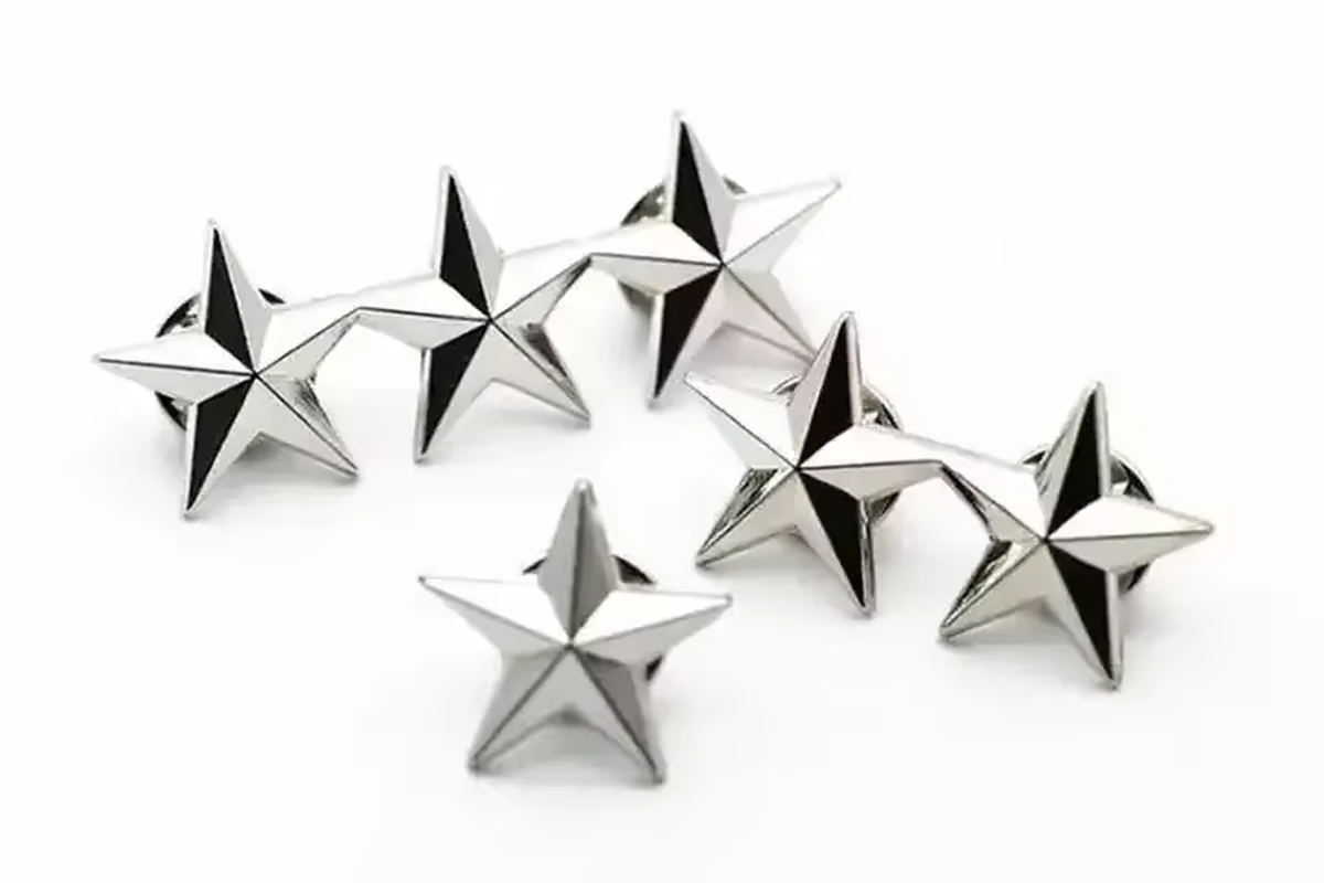
A metal-only pin needs a deliberate plan for shape, relief and surface contrast. Decide which features should be raised, recessed or open; establish the hierarchy of the emblem and lettering; then confirm how the selected finish makes those features visible. Removing the colors from a logo is only the beginning of that design decision.
This guide focuses on designing a die struck pin without enamel color. It helps buyers describe the result they need, compare a manufacturing proposal and review the sample. It does not set a universal minimum line width, relief depth or material thickness.
1. Define the metal-only result you actually want
“Die struck” describes a manufacturing route, while “no enamel” describes a color choice. The two terms do not define every aspect of the finished badge. Record the intended construction and appearance separately.
A useful initial brief might be: “A metal-only crest with a prominent shield and readable organization name, using an antique silver appearance.” The supplier still needs to review the material, dimensions, relief interpretation, attachment and packaging.
| Decision | Explain in the brief | Confirm before approval |
|---|---|---|
| Main identity | Which symbol or wording must dominate | Recognizable emblem at the actual size |
| Raised versus recessed | Intended relationship between major areas | A labeled drawing and representative sample |
| Outline | Solid perimeter, projections or proposed openings | Manufacturing proposal and resulting shape |
| Finish | Desired visual reference, described separately from material | Actual finish on the sample |
| Reverse | Attachment, orientation and any back detail | Complete sample, not just the front image |
Do not approve a process from a photograph alone. A metal-looking badge might have been made by a different route. Provide the reference to explain your visual goal and ask the manufacturer to identify the proposed construction.
2. Translate color differences into visible structure
List the features currently separated by color. In a metal-only interpretation, neighboring elements may need a different relief level, clearer spacing or another agreed surface treatment to remain distinct.
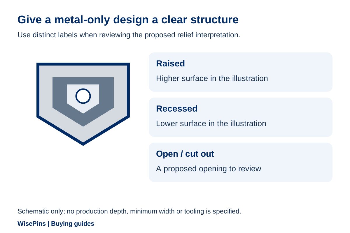
Use a simple artwork key. For example, mark the main shield as raised and its surrounding field as recessed. Mark an opening as an opening, rather than leaving a white area that could be interpreted as flat metal or background.
| Original logo feature | Decision for a metal-only interpretation | Buyer question |
|---|---|---|
| Colored border around an emblem | Defined outline and separation from the center | Can the border remain recognizable at the chosen size? |
| Several adjacent color areas | Prioritized shapes with a proposed relief relationship | Which distinctions are essential to the identity? |
| Fine lettering over a colored banner | Revised spacing or layout where necessary | Does the full wording remain readable on the sample? |
| Shaded illustration | Simplified relief proposal or another product route | Is the simplified interpretation acceptable? |
| White internal shape | Recessed metal, flat metal or a real opening | Which physical result is intended? |
This table is an interpretation tool. It does not claim that every feature can be reproduced as a separate relief level or cutout. Mark the intent, then have the manufacturer review the actual design.
Keep a copy of the original colored file beside the proposed metal-only version. If a change affects a protected emblem or essential wording, obtain your organization's approval rather than treating it as an invisible production adjustment.
3. Make the manufacturing route explicit
A stamped relief design and a cast design should not be treated as interchangeable merely because both can look metallic. Ask the quote to identify the proposed route and any changes it requires. A deeply modeled shape or a complicated opening may lead to a different proposal from a flatter emblem.
Signature Pins describes die struck pins as designs formed from a custom die. This explains the basic category, not the feasibility of a particular artwork or a rule about how much three-dimensional detail your design can contain.
WisePins offers die struck and 2D/3D metal design options, with the suitable combination confirmed against the project. Where the distinction matters, ask the drawing to label the proposed raised and recessed areas and have the supplier explain the route quoted.
Avoid filling in missing dimensions yourself. If thickness, relief depth or an internal opening is important, identify the requirement and request a feasible specification. A photo of a similar pin cannot establish the dimensions or tolerances of the proposed one.
4. Choose finish contrast with a physical reference
A bright finish and an antique appearance can make the same relief read differently. Reflection, the relationship between high and low areas, and the orientation of the pin influence how a viewer sees the design.
Jin Sheu explains an antique-finish example in which the higher and recessed areas have different visual contrast after finishing. The useful buying principle is to examine the finish on the proposed form, rather than selecting a color name in isolation.
WisePins' confirmed finish choices include gold, silver, nickel, black nickel, antique gold, antique silver and antique brass appearances, subject to the actual product and design. A finish name does not establish precious-metal content, coating thickness or a corrosion-test result.
For comparison, request consistent views: straight on, angled and in the intended presentation. If a key word disappears in a strong reflection, discuss the layout or surface proposal before assuming that another digital color value will solve the issue.
If you need a particular material or performance requirement, state it before quotation and agree the evidence. Do not infer it from “antique,” “polished” or a photograph that happens to look darker.
5. Review detail at its finished size
View the proposed artwork at actual size and check the central emblem before examining decorative detail. Then read all wording without referring back to the original logo. A reviewer who did not draw the design can help expose ambiguous letters or crowded areas. Use that drawing review to identify changes; confirm the finished metal's legibility and wearing orientation on the physical sample.
| If the review shows this | Discuss this change | Recheck after revision |
|---|---|---|
| The main emblem blends into its border | Clearer separation, layout or relief interpretation | Identity and visual hierarchy |
| A motto is too crowded | More space, a revised arrangement or larger overall size | Exact wording and intended wearing position |
| Small decoration dominates the design | Reduced detail or emphasis elsewhere | Whether the result still fits the identity |
| Narrow projections look vulnerable or awkward | Revised outline and construction proposal | Actual shape and suitability for the project |
| The rear drawing leaves the wearing orientation unclear | Attachment placement and reverse layout | Actual orientation on the physical sample with the intended backing and presentation |
Do not convert a design concern into an unsupported technical limit. Ask the manufacturer to mark which feature needs adjustment and why. Agree changes on the drawing, then inspect the corresponding area on the sample.
For a logo that depends on gradients or a complex image, compare printed pins instead of forcing a metal-only interpretation. If color-filled regions are important, discuss enamel pins. Choosing another route can be the correct design decision.
6. Keep the quote tied to the approved interpretation
A request for “antique crest pins” leaves too many choices open for a fair price comparison. Use the same artwork revision, dimensions, proposed material and construction, finish, attachment, quantity and packaging for each quote.
Ask for tooling, samples and other separately charged work to be identified. If a supplier changes the outline or process, show that alternative in its own column. You need to know whether a saving comes from an acceptable adjustment or from losing an essential feature.
Use this short brief:
Metal-only design ID and revision: [identify]. Must retain: [symbol and exact wording]. Proposed dimensions: [width × height, units]. Please label the raised, recessed and open areas. Identify the suitable material, route and finish, plus the attachment and packaging. Quote quantity per design and state sample/tooling charges and delivery scope. Mark any design change separately for approval.
At WisePins, the minimum order is 500 pieces per design; different designs are calculated separately. Ask how a changed year, title or other proposed version affects that count before committing to a series. The quotation guide explains the comparison method in more detail.
7. Inspect the sample beyond its shine
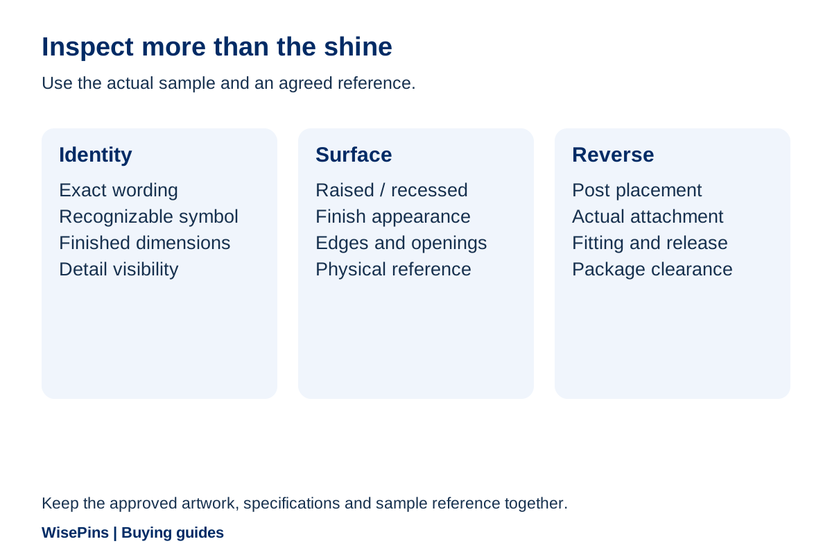
Match the sample to the correct artwork and specification. Confirm the outline, main emblem, lettering, raised/recessed relationships, finish appearance and reverse arrangement. Inspect the complete pin in its agreed presentation, including a backing card or gift package where applicable.
Separate three questions in your notes:
- Does the object follow the approved design and specification?
- Does that design communicate well as a metal-only pin?
- Is a requested change a correction or a new preference?
This separation makes feedback useful. “The lower word is not the wording in artwork R4” is different from “we would now prefer a larger motto.” The second may be a legitimate request, but it changes the specification and needs a response on cost, timing and further sampling.
A sample's shine does not establish metal composition or performance. When such evidence is required, agree it explicitly. For ordinary visual and handling review, record what you checked and what remains open using the sample approval checklist.
8. Save enough information for a repeat order
Keep the final design file, labeled relief interpretation, dimensions, material and finish description, attachment, package specification and approval reference together. Photographs support that record but do not replace it.
Record the orientation and lighting of comparison photos where appearance is important. A later buyer needs to know which image explains a design detail and which reflects a temporary lighting effect.
For a reorder, identify what stays unchanged and list any new wording, year, dimension or finish request. Ask the supplier to confirm tooling availability, current specifications, quotation and sample needs. A familiar logo does not mean a revised version can be released under an earlier approval.
Frequently Asked Questions
No. Die striking forms the metal design, and that design can also receive enamel fill; Jin Sheu's die struck soft enamel pins provide a manufacturer example. Some catalogs use “die struck pins” as the category name for the unfilled, metal-only style. This guide concerns that unfilled style. Specify “without enamel fill” in your brief and confirm the construction instead of relying on the category name alone.
It may be possible, but the identity needs reinterpretation. Decide which shapes, wording and relationships matter, then review a labeled relief proposal. If a crucial distinction depends on color or photographic detail, compare an enamel or printed route before choosing.
No finish name guarantees legibility. Contrast depends on the actual design, dimensions and finish. Compare the proposed result at finished size and review a sample, especially where small wording or crowded decoration carries important information.
You can use a visual reference to start the discussion, but the final quotation should identify the material and finish separately. A gold-colored photograph is not a complete specification or evidence of precious-metal content.
Use it together with the previous approved artwork, specifications and order reference. Confirm any changes and the current proposal. A photo alone does not establish thickness, relief dimensions, material or the condition of available tooling.
Discuss a metal-only version of your design
Send the emblem or sketch, exact wording, intended wearing or presentation context, quantity per design and a finish reference if you have one. Mark the details that must remain and those open to adjustment.
Explore custom die struck pins or contact WisePins to discuss an appropriate interpretation and sample.
Discuss Your Project